Observer Design: subverting existing patterns and drawing together new stories with APFEL…
From the grille of their east London studio onwards, you get a sense of graphic designers Kirsty Carter and Emma Thomas’ approach. Their agency name is written in letters sketched specifically for the metalwork, and produced according to the proportions of the golden ratio. The name spelt out is Apfel which stands for A Practice For Everyday Living, a nod to the title of French scholar Michel de Certeau’s 1980 book, The Practice of Everyday Life.
Carter and Thomas started the company in 2003, after meeting on the Royal College of Art’s communication, art and design course. They were inspired by De Certeau’s description of “a way of making sense of a place by collecting materials, subverting existing patterns and drawing together new stories”. As Carter says: “We loved the connection of De Certeau’s writing … the references you gather from your daily rituals of everyday life.”
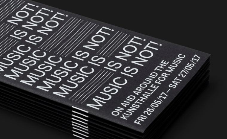
Now Apfel is the art world’s favourite studio, working with institutions such as the Tate and individual artists, designing posters, art books, exhibition signage and invitations – encompassing everything from the micro to the macro.
Its breakthrough moment came in 2011, overseeing the visual identity for The Hepworth Wakefield, the museum dedicated to the sculptor Barbara Hepworth, creating new typefaces, signage and wayfinding, as well as website and permanent exhibition graphics. “It was unusual for them to trust a single design agency, let alone one so young,” says Thomas.
The project is typical of the space they like to work in: that intersection between art and design in areas involving what Carter describes as “a closeness and a conversation: a sense of collaboration”.
This attention to detail is clear in all its projects. Apfel makes books and catalogues for Portuguese artist Leonor Antunes. All feature exposed binding, which echoes the stitching in Antunes’ work. The packaging Apfel created for the shoe brand John Lobb has a speckled pattern inspired by the shavings and spatters found on the company’s workshop floor.
The duo seem particularly proud of their work creating artist monographs, which they have done for names including Lee Krasner, David Hockney and Jeremy Deller. “Printed material is a space in the same way an exhibition is,” says Thomas. De Certeau couldn’t have put it better.